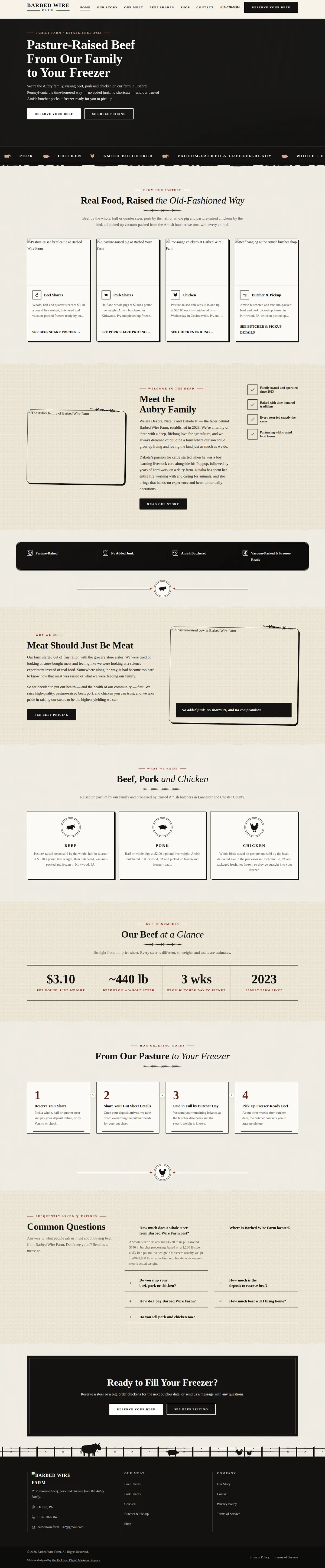
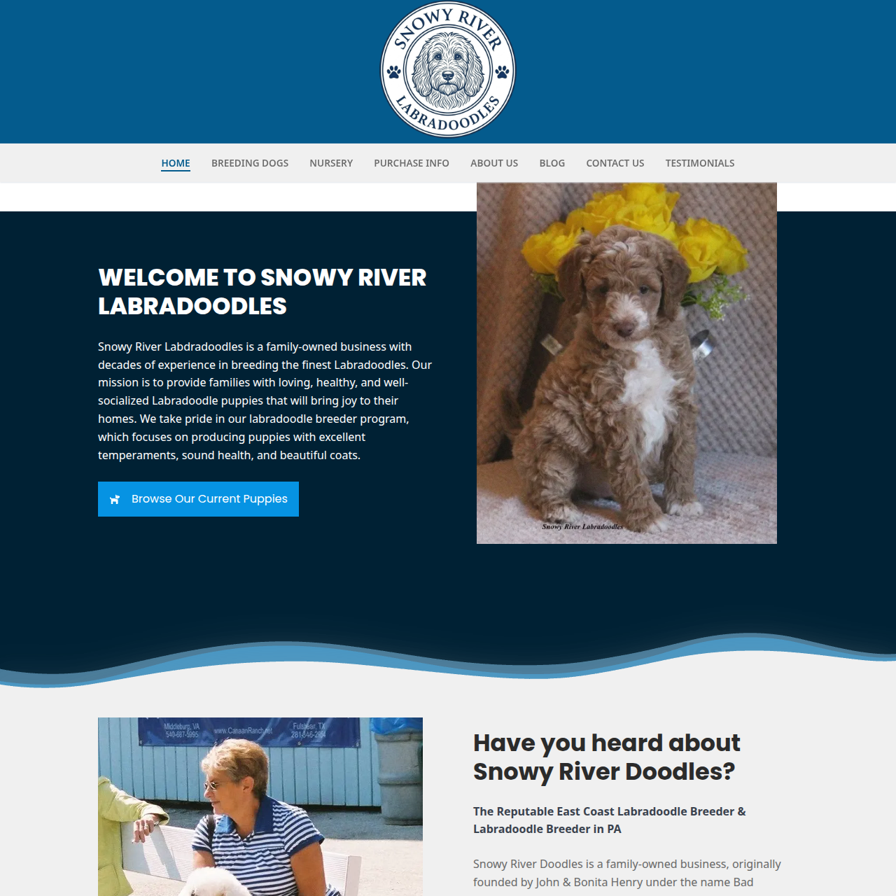
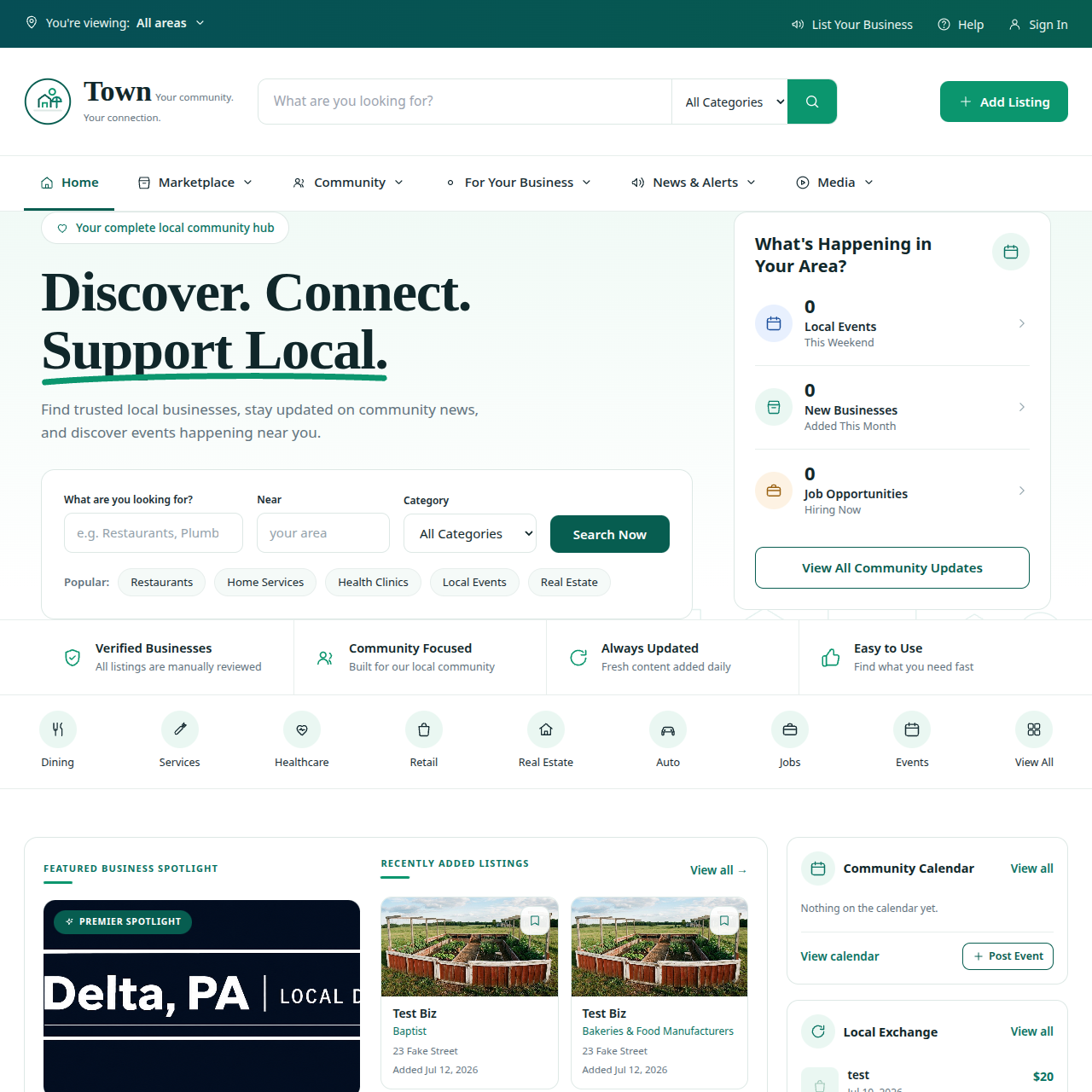
The majority of local searches now happen on a phone, and a phone is the harshest test a site gets: a slower connection, a smaller viewport, and a person who is standing somewhere with something else to do. A layout that merely shrinks is not a mobile layout — tap targets end up too small, forms ask for too much, and the phone number is a picture rather than a link.
Speed is the part owners underestimate most, because the site feels fast on the machine it was built on, with everything cached. It is not the same experience on a three-year-old Android on a patchy signal. The usual culprits are unremarkable: images exported at 4000 pixels wide and displayed at 600, a slider carrying three libraries, fonts loaded from four sources, and a plugin stack where each addition seemed harmless.
We size and compress images on upload, strip what is not used, self-host fonts, and set explicit dimensions so the page does not jump around as it loads. None of it is clever. All of it is the difference between a visitor waiting and a visitor leaving — a slow website loses customers before they read a word, and mobile-first web design explains why responsive on its own stopped being enough.